http://www.neiu.edu/~ejhowens/377/examples.htm
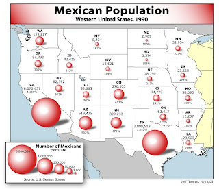
This point pattern map displays data with a circle, which varies in size based on the population. The size relates to the population of the state, which makes it a bit less informative compared to a dot distribution map, which would give more information regarding the spread of the population over the area.
No comments:
Post a Comment