http://uwacadweb.uwyo.edu/JSHINKER/animations/global/
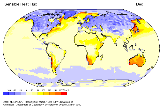
This cartographic animation shows fluctuations in sensible heat across the globe. This type of map shows statistical information over a period of time, allowing for a more dynamic visual representation of interval changes in a map.
No comments:
Post a Comment